Carbon Cycle Diagram from the IPCC
IPCC AR4 WG1
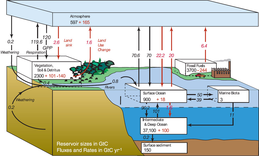
This diagrams illustrates Earth's carbon cycle. It shows how carbon atoms 'flow' between various 'reservoirs' in the Earth system. Reservoirs are shown as rectangular blocks; flows between reservoirs are indicated by arrows. The sizes of reservoirs are in units of gigatons of carbon (GtC). Flows between reservoirs are in units of gigatons of carbon per year (GtC yr-1). Red arrows and numbers indicate flows and changes in reservoir sizes associated with human activities such as burning fossil fuel and land use changes. Black numbers and flow arrows indicate typical values prior to major human influence. This diagram was created by the Intergovernmental Panel on Climate Change for the Working Group 1 portion of its Fourth Assessment Report (figure 7.3 in chapter 7: Couplings Between Changes in the Climate System and Biogeochemistry). The values for human influences represent the state of the carbon cycle in the mid-1990s.