Sounding Climate in the Classroom
Students interpret model data through a climate simulation using sounds and visuals to make a forecast of climate change and changes to Arctic sea ice over this century.
Learning Goal
- Students will learn how a model of the Earth system can be used to analyze and predict climate change.
- Students will learn how data can be represented through sound and visuals to help us understand change over time.
Learning Objective
- Students will make hypotheses about climate change and then test their hypotheses with the model data.
- Students will interpret model data that is represented through sound and visuals in order to learn about precipitation, temperature, and sea ice change over time.
- Students will make a forecast of how the climate will change by 2100 if carbon dioxide emissions are not reduced (the “business as usual” scenario).
Materials
- Projector and computer with speakers for the classroom
- A computer or tablet with Internet access for each student
- Headphones for each student
- Simulation: Sounding Climate
- A map of the world for reference (optional)
Preparation
- Review the simulation and try the explorations before class.
- Consider whether alternate formats will be needed for students with vision or hearing impairment (see Accessibility below).
Directions
Introduction
- Explain that models of the Earth system are used to help us understand future climate change due to greenhouse gas emissions. Tell students that they will explore the data represented from an Earth system model. Note: if your students are unfamiliar with the concept of Earth as a system, or with climate modeling as a way to understand climate change, take time to explain and give examples here before moving on.
- Project the Sounding Climate simulation, click on “each on its own” and introduce the interface. Explain that the model data in Sounding Climate comes from the NCAR Community Earth System Model (CESM), which simulates past and future climate from 1920-2100. (See the Background section below for additional information.)
- Introduce students to the three types of model data: temperature, precipitation, and sea ice. (You can toggle between the three on the left side of the screen.)
- Temperature: degrees Celsius temperature change, based on annual averages compared to 1920-1950 averages.
- Precipitation: percentage change compared to 1920-1950 averages, based on annual averages.
- Sea ice: the percentage of sea ice at a location during the month of September.
- Introduce how data is represented within Sounding Climate.
- The maps (also known as data visualizations) represent the model data with colors. The color key is below the maps.
- The sound that can be heard once you click “play” (which is called a sonification) represents the model data as sounds. Click the color key below the maps to hear how sounds match up with data values.
- The graph shows how precipitation, temperature, or sea ice changes alongside changes in carbon dioxide concentration.
- Note that there are six maps because the model was run many times, changing the initial temperature by a tiny amount. This makes each model run unique in its natural variability.
- For the following explorations, have students navigate to Sounding Climate on their own computer or tablet. Use headphones if all students are in the same room.
Exploration 1: Precipitation change over time
- Remind students that as climate warms, patterns of precipitation are changing. Ask students to make a hypothesis about how precipitation has changed over the past century and how it is likely to change during this century. Write one or more of the hypotheses on the board.
- Have students select “precipitation” and choose a location by clicking anywhere on one of the maps or by selecting a location from the dropdown list. Then students should press the green play button, listen to the sonification, and watch the visualizations. You could decide as a class what locations would be most interesting to observe and assign certain students to those locations, or simply let students decide on their own which locations to observe.
- Once students have heard and seen the data from 1920-2100, review what they found by asking the following questions:
- Will precipitation change in the same way everywhere? (Students should notice in the map visualizations that precipitation increases in some places and decreases in others.)
- How does precipitation at the location that you selected change over time? (Students will have heard the variation in precipitation over time for their selected location and can review how it changed in the graph below the maps.)
- As a class, decide whether the model data supports any of the hypotheses and if it disproves any of the hypotheses.
- Tell students that, in addition to precipitation, this sonification includes carbon dioxide in the sound and in the graph at the bottom of the screen. How did carbon dioxide change over time? (Students will have heard the increase in CO2 and they can see it in the yellow line on the graph below the maps.)
Exploration 2: Comparing past and future temperature
- Explain that, as carbon dioxide levels increase, more heat is trapped in the atmosphere and the climate warms. Ask students to make a hypothesis comparing the amount of warming between 1920 and this year with the amount of warming between this year and 2100. Write one or more of the hypotheses on the board.
- Have students choose “temperature” and select a location.
- Instruct students to play the sonification until around the current year and then stop the sonification by clicking the “stop” button (which replaces “play” when the sonification is playing).
- Have students take off their headphones and share with a partner what they saw in the maps and heard from 1920 to present. Did the temperature change? If so, how?
- Instruct students to press play again to allow the sonification to play from the present to the end of this century.
- Have students take off their headphones and share with the same partner what they saw and heard from the present to 2100. How did it compare with temperature change in the past?
- Review what students found by asking the following questions and considering the hypotheses.
- How is the likely temperature change in the future similar to, or different from, temperature change in the past? (Students should recognize that temperature will warm at a faster rate in the future than it has in the past century.)
- Tell students that this model assumes a “business as usual” scenario for CO2 emissions, meaning that emissions are not stopped or reduced. Ask students how they’d forecast temperature change if CO2 emissions are stopped. (Students may say that warming will slow down. If students wonder whether the world will cool when emissions are stopped, remind them that even if we stop adding CO2 to the air, the amount that is already in the atmosphere is high, so the temperature will not cool and we are committed to a certain amount of warming.)
- Have students look at the maps of temperature in 2100 and ask them where the temperature is likely to increase the most. (The maps show the most warming in the Arctic.)
Exploration 3: How climate change will impact Arctic sea ice
- Introduce Arctic sea ice: The surface of the ocean at the North Pole often freezes. This sea ice is an important part of the ecosystem (polar bears use it as a platform from which to hunt for seals, for example). It also plays an important role in reflecting the Sun’s energy away from Earth. But as temperatures warm in the Arctic, ice is melting.
- Have students choose “sea ice” in Sounding Climate. If needed, orient students to the maps, which have a polar projection showing the area around the North Pole.
- Have students select a location within the sea ice (white) and press “play” while listening through headphones.
- Ask students what happens to sea ice in the future. (Students should notice that there is a rapid decline in the amount of sea ice within the next two decades and it is eventually entirely gone. Students who select a location at the edge of the sea ice will see more year-to-year variations in the ice data. Students who select a location in the center of the sea ice will not see much change until the rapid decline.)
- Explain that one reason the decline is so rapid is because once sea ice starts melting, it triggers more sea ice to melt because less solar energy is reflected away. This is called a “feedback loop.”
Assessment
As an exit ticket or homework, have students write a forecast that describes how temperature, precipitation, and sea ice will change by the year 2100 if we don’t stop carbon dioxide emissions. Instruct students to cite evidence from their Sounding Climate explorations to support their forecast.
Extensions
- Have students explore the “all together” option within Sounding Climate to hear the temperature, precipitation, and sea ice data all at once. The maps in “all together” will allow students to compare the human influence on climate with the combined human influences and natural variability.
- Have students create a sonification of a more simple dataset from the natural world. Students will need to attach notes to data values and then play an instrument to represent the data as sound.
Background
Sounding Climate lets you explore how precipitation, temperature, and sea ice change over time through data represented in graphs, maps, and sonifications. Select a location on the map, and experience, through sight and sound, how climate varies over time.
- Sonification: Each data value is assigned a particular pitch, and each variable is played by a different instrument (synthesized tones representing marimba for precipitation, clarinet for temperature, and violins for sea ice). Carbon dioxide levels control the musical scale of the pitches assigned to the data values.
- Maps: Each map shows a different rendition of natural climate variability, superimposed upon a common human influence. By sliding the cursor over the color bar beneath each map and clicking to select a specific position, you can see and hear how the data values are mapped to color and pitch. You can also hear geographical patterns in the data by sliding the cursor directly over the maps and clicking on a specific location.
- About the data: The temperature values are based on annual means and expressed in degrees Celsius change relative to a 1920-1950 baseline; the precipitation values are also based on annual means and expressed as a percentage change relative to a 1920-1950 baseline; and the sea ice fraction values are for the month of September and expressed as the percentage of sea ice present in each grid cell.
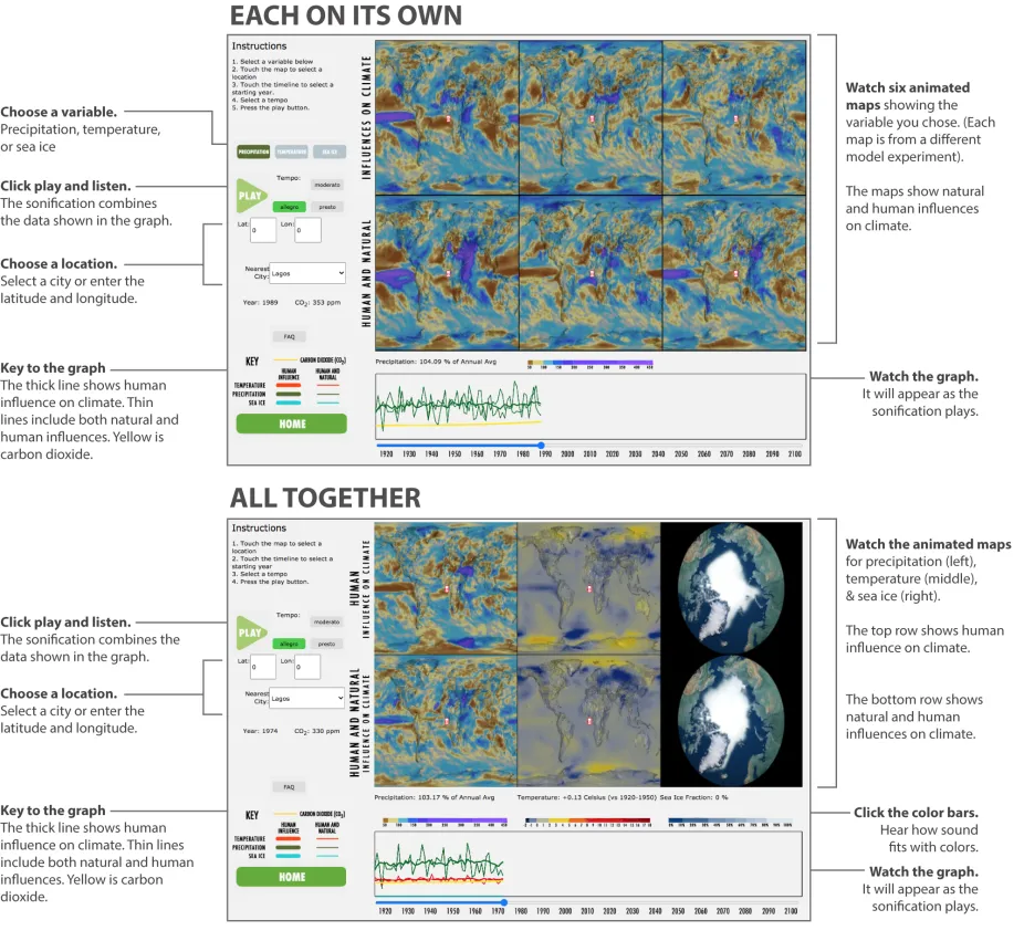
In the "each on its own" part of Sounding Climate (top), choose a variable, choose a location, and then click play and listen. Watch the graph and the animated maps to see and hear climate change. In the "all together" part of Sounding Climate (bottom), choose a location and click play. Watch and compare how the human influences on climate (the top row of maps) compare with the natural and human influences combined (the bottom row of maps).
UCAR
About the model data in Sounding Climate
The sonification and visualizations in Sounding Climate are based on data from one of the world’s most comprehensive numerical models of the Earth’s climate system, NCAR Community Earth System Model version 1 (CESM1). This model simulates past and future climate from 1920-2100, assuming a “business-as-usual” scenario for rising concentrations of carbon dioxide and other greenhouse gases due to the burning of fossil fuels. In addition to human influences on climate, the model also includes natural sources of climate variability in the oceans, atmosphere, land, and sea ice, such as those that produce El Niño events or multi-decadal changes in the Atlantic Ocean’s overturning circulation.
In order to learn about climate variability, CESM1 was run 40 times with minuscule changes in the initial atmospheric temperature. This allowed scientists to untangle human and natural influences on climate. Each experiment contains its own unique sequence of natural variability, which cannot be predicted more than a few years in advance, superimposed upon a common signal of human-caused climate change. The human impacts on climate were isolated by averaging all of the 40 experiments together. In the “each on its own” section of Sounding Climate, six of the 40 model runs are represented visually.
How Sounding Climate was made
Sounding Climate began as a collaboration between climate scientist, Dr. Clara Deser (at the National Center for Atmospheric Research - NCAR) and sound designer and data artist, Marty Quinn (founder of the Design Rhythmics Sonification Research Laboratory). A version of Sounding Climate was created for the exhibits at the NCAR Mesa Lab in Boulder, Colorado, by the team at the UCAR Center for Science Education. Then, the web-based version of Sounding Climate used in this activity was developed by engineering students at the University of Colorado, Boulder.
Accessibility
If there are vision impaired and/or hearing impaired students in your class, students will need to interpret the data through either sonification or visualizations instead of both. Having students work on the explorations in pairs, with at least one member of each pair having unimpaired vision, can help students recognize how the timeline fits with the data and the timing of events like the rapid decline in sea ice. Students with certain types of colorblindness may see general patterns in the data visualizations and may wish to focus more on the sonification as they interpret the data.